


August 20, 2026
A SMB Guide to Increase Ecommerce Conversion Rates
Want to get more sales from your ecommerce store? It’s not about guesswork or randomly changing button colors. It’s about having a structured process—what we in the business call Conversion Rate Optimization (CRO).
Think of CRO not as a one-time project, but as a core part of your business dedicated to figuring out why people aren't buying and then systematically tearing down those barriers.
A scattered approach just doesn't work. Trying a few pop-ups one week and changing product photos the next rarely leads to sustainable growth. It's a recipe for wasted time, messy data, and a whole lot of frustration. A disciplined framework, on the other hand, saves you resources and actually drives results.
Your Starting Point for Higher Conversion Rates
The most effective way to approach this is with a simple, repeatable loop. This process ensures your changes are based on solid evidence, not just a gut feeling.
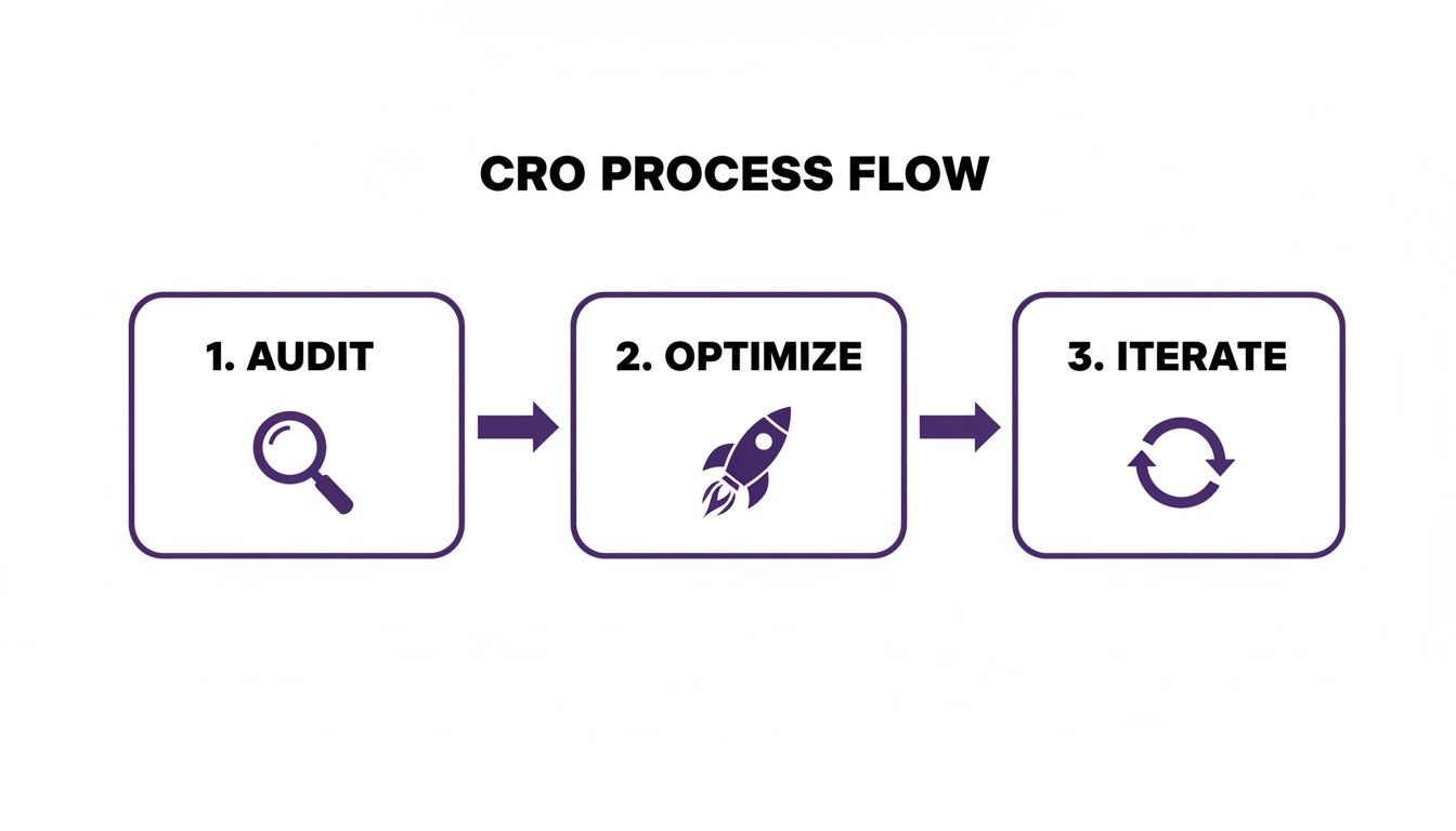
As you can see, CRO isn't a straight line with a finish line. It’s a continuous cycle of improvement where each step feeds the next.
Setting Realistic Benchmarks
Before you start changing things, you need a baseline. What even is a "good" conversion rate?
A decade ago, you'd be happy with 1.5% to 2.5%. Thanks to better user experiences and one-click payments, that average has climbed to the 2.5%-4.0% range. But here's where it gets interesting: desktop still reigns supreme.
- Desktop conversion rates average around 4.8%.
- Mobile, which now accounts for a whopping 73% of traffic, converts at just 2.9%.
That mobile gap is a massive opportunity for most stores.
To give you a clearer picture, here's a look at some current industry benchmarks. Use these to set some realistic goals for your own efforts.
Key Ecommerce Conversion Rate Benchmarks
| Platform | Average Traffic Share | Average Conversion Rate |
|---|---|---|
| Desktop | 23% | 4.8% |
| Mobile | 73% | 2.9% |
| Tablet | 4% | 4.0% |
These numbers give you a solid reference point. If your rates are below these averages, you know you've got room to grow.
The goal isn't just to drive more traffic; it's to create an experience so seamless and trustworthy that a higher percentage of your visitors want to complete their purchase. This mindset shift is the true foundation of successful CRO.
It’s also crucial to ensure your site is usable by everyone. This is where web accessibility comes into play. It’s not just about compliance; it's about broadening your customer base and creating a better experience for all. To dig deeper, check out this great article on Accessibility in E-commerce: Improving User Experience and Sales.
So, where do you start? A quick health check of your conversion funnel is the perfect first step. Jump into your analytics and find the biggest drop-off points. Is it from the product page to the cart? Or from the cart to checkout? Pinpointing these leaks gives you a clear starting point for everything we'll cover in this guide.
Getting Your Data Foundation Right
If you want to seriously boost your store's conversion rate, you have to stop guessing. Guesswork is expensive, but good data is a roadmap straight to more revenue. This isn't about just slapping a basic analytics code on your site; it's about building a system that tracks the entire customer journey, so you know not just what's happening, but why.
Your starting point is a properly configured analytics platform, which for most of us means Google Analytics. But just having the tracking code active isn't enough. You need to flip the switch on the features that actually give you actionable ecommerce data.
This means getting Enhanced Ecommerce tracking set up. It’s a game-changer. It unlocks critical reports on shopping behavior, checkout performance, and even how people interact with your product lists. This is how you find out exactly where people are dropping off. Is it after they view a product? Or right as they're about to pull out their credit card?
Go Beyond Page Views and Track What Really Matters
Once your core ecommerce tracking is humming along, the next step is to set up event tracking. Events are all the little interactions that standard analytics miss—things like someone clicking "Play Video," downloading a size guide, or using a product comparison tool.
Tracking these "micro-conversions" gives you a much richer picture of how people engage with your site.
You might discover, for example, that shoppers who watch a product demo video are 50% more likely to add that item to their cart. Boom. That's a massive insight. It tells you right away that making more videos could be a huge win for your store.
A good dashboard brings all these key performance indicators together in one place.

This kind of visual setup helps you spot trends instantly, like a sudden drop in your "add to cart" rate or a revenue spike from a specific marketing channel.
The "Why" Behind the "What": Adding Qualitative Tools
So, analytics data tells you what happened. To understand why it happened, you need tools that show you how real, live humans actually experience your website. This is where things like heatmaps and session recordings are absolute gold.
- Heatmaps: Tools like Hotjar or Microsoft Clarity create visual maps showing where people click, move their mouse, and scroll. A heatmap might immediately reveal that nobody is clicking your main call-to-action button simply because it's buried below the fold on mobile.
- Session Recordings: Think of these as anonymized screen recordings of real visitors. Watching just a handful of these can be an eye-opening, "I can't believe they're doing that!" experience. You might see someone repeatedly trying to click on an image that isn't a link or getting stuck in a frustrating checkout loop you never even knew was there.
The real magic happens when you combine the two. Let's say your analytics shows a high bounce rate on a product page (the what). A session recording might show you a user getting visibly frustrated trying to figure out your size selector (the why). Now you have a clear, powerful hypothesis to test.
Focus on the KPIs That Actually Move the Needle
With all your tools in place, you have to focus on the Key Performance Indicators (KPIs) that directly impact your bottom line. Chasing vanity metrics is a waste of time.
Here are the essentials you should be watching like a hawk:
- Overall Conversion Rate: This is your north star. It's the percentage of visitors who actually complete a purchase.
- Cart Abandonment Rate: This shows the percentage of people who add items to their cart but bail before buying. A high number here is a huge red flag, often pointing to friction in your checkout process.
- Average Order Value (AOV): How much does the average customer spend per order? Getting people to buy more is just as powerful as getting more people to buy.
- Bounce Rate on Key Pages: A high bounce rate, especially on product or category pages, often means there’s a mismatch between what the user expected and what they found.
To keep a handle on all this, a simple ecommerce conversion rate calculator can be a lifesaver for running quick numbers and seeing the potential impact of your changes. This complete data ecosystem—analytics, user behavior tools, and a laser focus on the right KPIs—is the bedrock of any CRO strategy that actually works.
Alright, with your analytics humming along and data starting to trickle in, it's time to roll up our sleeves and play detective. This is where we conduct a full-blown ecommerce website audit—a deep-dive inspection of your digital storefront to find all the hidden "conversion killers."
These are the tiny points of friction, the confusing buttons, and the slow-loading pages that make potential customers throw their hands up and leave. We're not just looking for what's broken; we're hunting for opportunities to create a smoother, more convincing path to purchase.
Think of it like a secret shopper walking through a physical store. You’d check for a clean entrance, clear signage, and a quick checkout line. We’re doing the exact same thing for your website, focusing on three core areas: the technical foundation, the user experience, and the words on the page. This is a critical first step, much like a broader marketing audit, but laser-focused on getting more sales.
Uncovering Technical Roadblocks
Technical glitches are the silent assassins of conversion. They frustrate people before they even get a chance to see how great your products are. Our first mission is to make sure your site's engine is running smoothly and not getting in the way of a sale.
Start with site speed. Seriously, every single second counts. A measly one-second delay in page load time can slash your conversions by 7%. Use a tool like Google PageSpeed Insights to check your homepage, category pages, and especially your product pages. It'll point out the culprits, like massive image files or clunky code that's bogging everything down.
Next, get serious about mobile responsiveness. More than 70% of ecommerce traffic now comes from phones. A clunky mobile experience is simply not an option anymore. Don't just trust a simulator on your desktop. Grab your own phone, and have a friend use theirs. Try to buy something. Can you actually read the text? Are the buttons big enough to tap? A common offender is a checkout form that forces you to pinch and zoom like you're trying to crack a safe.
Finally, go on a hunt for broken links and 404 errors. Nothing screams "we don't pay attention to details" like clicking a link that goes nowhere. You can use the free version of a tool like Screaming Frog's SEO Spider to crawl up to 500 URLs on your site. It will spit out a list of every broken link you need to fix. This is an easy win that gives you an instant credibility boost.
Evaluating the User Experience and Journey
A lightning-fast site is great, but if it’s a maze, you're still going to lose people. This part of the audit is all about how easy and intuitive it is for someone to find what they want and give you their money.
Start by looking at your navigation and product discovery. If a first-time visitor lands on your site, can they immediately understand your product categories? Is your search bar easy to find and does it actually work well? I’ve seen so many brands get too clever here. A boutique might use a category name like "Wanderlust" for its travel collection, but a new visitor is searching for "Dresses" or "Jackets." Clarity always beats cleverness.
Key Takeaway: Your job is to minimize how much your user has to think. If they have to pause and figure out where to click next, you've already introduced friction. The path from the homepage to a product should feel completely obvious.
Now, put your checkout process under the microscope. This is the final step, and an astonishing 70% of shopping carts are abandoned right here. Go through your own checkout as if you're a brand new customer.
- Are you forcing people to create an account? This is a notorious conversion killer. Offer a guest checkout.
- Count the number of form fields and steps. Every single box they have to fill out is another chance for them to quit.
- Are shipping costs and taxes a nasty surprise at the very end? This is the #1 reason people abandon their carts. Be upfront about costs.
Assessing Your On-Page Messaging and Trust Signals
Last but not least, let's look at what your site is actually saying. Your words need to build trust, answer questions before they're asked, and tell the user exactly what to do next.
Start with your value proposition. When someone lands on your homepage, is it immediately obvious why they should buy from you and not your competitor? This needs to be a short, punchy statement that gets right to the point.
Next, audit your Calls to Action (CTAs). Are they boring and generic like "Submit"? Or are they compelling and action-focused like "Get Your Free Skincare Guide"? The color, size, and placement of your buttons matter, but the words you use matter most.
Finally, check for social proof. Can shoppers easily find customer reviews on your product pages? Do you have testimonials or photos from real customers? People actively look for these trust signals to feel good about their purchase. A product page with zero reviews feels like a gamble, while one with even a few honest ratings feels much safer. This whole process will give you your first real, data-backed list of things to start improving.
Optimizing Product Pages and the Checkout Funnel
This is where the rubber meets the road. The journey from a casual browse to a confirmed purchase is where most ecommerce stores bleed money. Your product pages and checkout funnel aren't just website sections; they're the final, critical moments where a shopper decides if you're worth their trust—and their cash.
It’s time to turn those audit findings into real, tangible improvements that show up on your bottom line. We'll start by dissecting what makes a product page truly convert, then we’ll plug the leaks in your checkout process.
Crafting High-Converting Product Pages
A product page has one job: convince someone to click "Add to Cart." If that doesn't happen, nothing else matters. Getting it right is a mix of powerful persuasion, crystal-clear information, and building instant trust.
It all starts with your visuals. Your customer can’t hold the product, so your photos and videos have to do all the heavy lifting. One polished hero shot just won't cut it anymore.
- Show Every Angle: Think front, back, side, and close-ups that highlight texture, materials, and tiny details people care about.
- Give It Context: Don’t just show the product, show it in action. A video of a blender actually crushing ice sells the power, not just the machine. If you sell clothes, show them on a few different body types.
- Communicate Scale: Include a photo with a common object (like a phone) or a model to give a sense of size. This small step cuts down on returns and pre-purchase anxiety like you wouldn't believe.
Next up, your descriptions. They need to sell an outcome, not just list specs. Instead of saying "100% organic cotton," try something like, "Breathe easier with fabric that's incredibly soft on your skin." Translate every feature into a real-world benefit.
Finally, build that trust right on the page. Don't make people hunt for customer reviews or shipping costs. Display ratings prominently. Be upfront about your return policy. A shopper who sees "hassle-free returns" right next to the buy button feels a lot more confident hitting it.
Streamlining the Checkout Funnel to Reduce Abandonment
The checkout is where good intentions go to die. Across the industry, the average cart abandonment rate is a brutal 71.3%. That’s seven out of every ten people who add an item to their cart just… leaving. This isn't a problem; it's a massive opportunity.
What's the number one conversion killer? Unexpected costs. Shipping fees and taxes that pop up at the very last second are kryptonite for sales.
Key Insight: Transparency is your best weapon against cart abandonment. Show all costs, or at least a shipping estimate, as early as you possibly can. Surprises at checkout feel deceptive and send shoppers scrambling for the "back" button.
Your goal is to make buying feel effortless. Every extra form field, every click, every slow-loading page is a chance for a customer to get distracted or change their mind.
Here are the fastest ways to fix it:
- Offer Guest Checkout: Forcing someone to create an account is a legendary conversion blocker. Let them buy as a guest, then offer to save their info for next time after the purchase is complete.
- Simplify Your Forms: Do you really need their phone number? Only ask for what's essential to fulfill the order. Use tools like address auto-completion to make it even faster.
- Provide Multiple Payment Options: Don't lose a sale because you don't offer PayPal. Include express checkouts like Apple Pay and Google Pay to let people buy with a single tap.
Winning Back Lost Sales with Cart Recovery
Even with a perfect checkout, life happens. People get distracted. That’s what an automated abandoned cart email sequence is for. These simple emails are your secret weapon for bringing people back.
A friendly, non-pushy reminder sent an hour or two after someone leaves can recover a surprising number of would-be sales. A classic, effective sequence looks something like this:
- Email 1 (1-4 hours later): Just a gentle nudge. "Did you forget something? Your items are waiting."
- Email 2 (24 hours later): Create a little urgency or show some social proof. "Heads up! Your items are popular and might sell out."
- Email 3 (48-72 hours later): If they're still on the fence, a small incentive like 10% off or free shipping can be just the push they need to close the deal.
By zeroing in on these high-impact areas, you’re not just tweaking your site—you’re removing the biggest roadblocks between a curious visitor and a happy customer.
Using A/B Testing and Personalization to Win Sales
Okay, so your audit and analytics have given you a treasure map. You can see the X's marking potential goldmines on your site. But a map doesn't dig the hole for you. For that, you need the right tools—and in CRO, those tools are A/B testing and personalization.
Guessing is the most expensive mistake you can make in e-commerce. Testing is how you stop guessing and start proving what actually works. It's a straightforward concept: pit two versions of a page against each other—the original (A) and your new idea (B)—to see which one gets more people to click, buy, or sign up. By showing each version to a different slice of your audience, you get cold, hard data on what truly moves the needle.

This is what it looks like in practice. You're not just throwing ideas at the wall; you're running controlled experiments to see which version better achieves your goals.
Prioritizing Your Tests for Maximum Impact
After a good audit, your to-do list is probably a mile long. If you try to test everything at once, you'll get lost in the chaos. You need a way to sort the game-changers from the minor tweaks.
We use a simple but incredibly effective framework called PIE:
- Potential: How big of an impact could this change realistically have? Fixing a broken "Add to Cart" button has massive potential. Changing the color of a footer link? Not so much.
- Importance: How valuable is the page you're testing? A tiny improvement on your highest-traffic product page will almost always beat a huge win on your "About Us" page.
- Ease: How much time and effort will this take to build? Swapping out headline copy is easy. A complete navigation redesign is a major project.
Score each test idea from 1 to 10 in each category. Add up the scores. The ideas with the highest totals are where you start. This isn't just about being organized; it’s about making sure your efforts are focused on tests that can increase ecommerce conversion rates fast.
From Hypothesis to Statistically Significant Result
Every good test starts with a clear hypothesis. It's not just "let's try a green button." It's an educated guess rooted in customer behavior.
For example: "Changing the product page CTA from 'Add to Cart' to 'Get Your Cooling Pillow Now' will increase conversions because it directly reinforces the product's primary benefit and adds urgency."
From there, you build the variation (Version B) and use an A/B testing tool to split traffic between the old and new pages. The crucial part is letting the test run long enough to hit statistical significance. This is the point where you have enough data to be confident the outcome isn't a fluke. Most tools will tell you when you've hit a 95% confidence level, which is the industry standard. If you want to get into the weeds of the methodology, our guide on what A/B testing in marketing is is a great place to start.
Your goal isn't just to find a "winner." Every test, even one that "loses," teaches you something. If a change tanks, you've just learned what your customers don't want. That's incredibly valuable information.
Moving Beyond One-Size-Fits-All with Personalization
A/B testing is fantastic for optimizing your site for the average user. But here's the thing: there's no such thing as an average user.
Personalization is the next level. It's about creating a unique, tailored experience for different groups of visitors based on who they are and what they're doing. The one-size-fits-all website is dead.
You don't have to get complicated to start. Begin with simple segmentation:
- New vs. Returning Visitors: Greet first-timers with a welcome discount. For returning folks, show them the products they looked at last time. It’s simple, but it works.
- Geographic Location: Automatically show prices in the local currency or call out region-specific shipping deals. This small touch makes international visitors feel right at home.
- On-Site Behavior: Someone has spent ten minutes browsing your "running shoes" category? The next time they land on your homepage, that main banner should be all about your newest running shoe collection.
When you shift from a static site to an adaptive one, you're showing each visitor that you understand them. And when customers feel understood, they convert. It's as simple as that.
Aligning Ad Campaigns with On-Site Conversions
Driving paid traffic to your store is a serious investment. Seeing that traffic bounce away without converting isn't just disappointing; it’s a direct hit to your budget.
So, what’s the most common culprit? A jarring disconnect between the ad a visitor clicks and the page they land on.
This gap creates instant friction. If your ad screams "50% Off Winter Coats," but the landing page is just your generic homepage, you’ve broken a promise. That mismatch makes visitors feel confused or even tricked, and they'll leave almost immediately. It’s called poor message match, and it’s one of the biggest reasons for wasted ad spend.
Creating a Cohesive User Journey
The fix is all about making the user’s journey seamless, from the first ad click right through to checkout. The promise you make in your ad has to be immediately and obviously fulfilled the second they hit your site.
Think about it: a Facebook ad showing a specific blue running shoe needs to click through to a dedicated page for that exact blue running shoe. The headline, the images, the core offer—everything must be perfectly consistent. This simple alignment reassures the visitor they’re in the right place, builds a little trust, and keeps them moving forward.
When your on-site experience perfectly mirrors your ad’s promise, you eliminate cognitive friction. The user doesn’t have to think, search, or second-guess their click. This is how you turn an expensive click into a valuable conversion.
Creating dedicated landing pages for your major campaigns is one of the most effective ways to increase ecommerce conversion rates from paid traffic. These pages should be stripped of distracting navigation and focused on a single, clear call to action that directly reflects the ad’s goal.
Building a Powerful Feedback Loop
This connection isn't just a one-way street. The testing you do on your site doesn't just improve your website; it gives you invaluable intelligence to feed back into your ad campaigns.
- A/B Test Insights: Did you A/B test a headline on your product page and find a winner that boosted add-to-carts by 15%? That winning headline should immediately be tested in your ad copy.
- Ad Creative Performance: Are your video ads blowing your static images out of the water? That’s a clear signal to feature more video content on your landing pages.
You end up creating a powerful feedback loop. Your on-site optimizations inform your ad strategy, and your ad performance data informs your on-site experience.
When you treat them as two halves of the same conversion funnel, you stop optimizing in silos and start improving the entire machine. For a deeper dive into making your ads work harder, our guide on how to optimize Google Ads is the perfect next step.
A Few Common Questions About Ecommerce Conversion Rates
So, what should you actually be aiming for? And how long until you see the needle move? These are the questions every store owner asks when they start digging into conversion optimization. Let's set some realistic expectations.
What Is a Good Ecommerce Conversion Rate?
The honest answer? A "good" rate is always better than what you have right now. But if you need a number to shoot for, the industry benchmark hovers between 2% and 4%.
Keep in mind, that’s just an average. This number gets pulled in different directions by your industry, how much your products cost, and where your traffic is coming from.
For example, we often see desktop users convert at a much higher rate (around 4.8%) than mobile shoppers (around 2.9%). Instead of getting fixated on a universal number, your real goal should be to beat your own baseline, month after month.
How Long Does It Take to See Results?
This really depends on what you change. Quick wins—like speeding up your site or adding a guest checkout option—can show a positive impact in just a few weeks. They remove obvious friction, and customers notice right away.
But a full-blown CRO strategy with A/B testing and personalization isn't a one-and-done fix. It's a long-term game. You should expect to see slow, steady gains over several months as you test ideas, learn from the data, and double down on what works for your specific audience.
Ready to stop guessing and start growing? The experts at Frozen Crow Inc. can build a data-driven CRO strategy to turn more of your visitors into customers. Get your free marketing audit today!


