


October 13, 2026
Improving Ecommerce Conversion Rates
Before you touch a single button or A/B test a headline, you need to get brutally honest about where your store stands right now. Guesswork is the fastest way to waste time and money. The real work of improving your conversion rate starts with a clear, data-backed baseline. This isn't just about finding one magic number; it’s about understanding the full story behind it.
Where Your Store's Conversion Rate Really Stands
So, what’s a “good” conversion rate? Honestly, it's a bit of a trick question. The answer completely depends on your industry, what you sell, and how much it costs. A store selling high-end furniture will naturally have a much lower conversion rate than one selling everyday cosmetics.
Chasing a generic, industry-wide average is far less important than building a system for consistent, internal improvement. It's about beating your own numbers, month after month.
Pinpointing Your Current Performance
Your analytics platform, like Google Analytics 4, is your ground truth. The first stop is finding your overall ecommerce conversion rate. But don’t stop there—the real insights are buried a layer deeper. You need to segment that data to see what's actually going on.
Start digging for the big performance gaps:
- Device Discrepancies: Is your mobile conversion rate tanking compared to desktop? This is a classic problem and almost always points to a clunky user experience on smaller screens.
- Traffic Source Value: Are visitors from your email campaigns buying more than folks clicking on your social media ads? Knowing this tells you exactly where to double down on your marketing spend.
- New vs. Returning Visitors: These two groups behave very differently. Understanding how they convert (or don't) is key to building out your personalization and loyalty strategies.
This initial deep dive gives you the "what." It shines a big, bright light on the areas that are bleeding cash and need your immediate attention.
Finding the Conversion Bottlenecks
Once you have your numbers, the real fun begins. You have to figure out why they are what they are. Where are potential customers getting frustrated, confused, or just plain giving up? Your analytics can point you to the pages with the highest exit rates. A popular product page with a high exit rate is a massive red flag—it could be anything from blurry images and weak descriptions to confusing pricing or a hidden "Add to Cart" button.
Globally, the average ecommerce conversion rate hovers between 2% and 4%, but this figure can be misleading. Personal care products, for instance, often enjoy rates around 6.8% thanks to frequent repurchases. On the other hand, industries like home decor (1.4%) and fashion (1.9%) see lower numbers because customers take more time to decide.
Device is another huge factor. Desktop users convert at an average of 4.8%, which is way higher than mobile users at 2.9%—even though mobile now drives most of the traffic. This gap screams for better mobile optimization across the board. If you're curious about how your industry stacks up, you can check out some great ecommerce benchmarks from Speed Commerce.
Here’s a quick look at how conversion rates can vary.
Ecommerce Conversion Rate Benchmarks by Industry
This table offers a quick reference for average conversion rates across different ecommerce sectors, helping you see how your store's performance compares.
| Industry | Average Conversion Rate |
|---|---|
| Arts & Crafts | 4.0% |
| Pet Care | 3.3% |
| Food & Beverage | 5.5% |
| Health & Beauty | 3.3% |
| Fashion & Apparel | 1.9% |
| Home & Garden | 1.4% |
| Electronics | 1.6% |
| Sports & Recreation | 2.5% |
Keep in mind, these are just averages. The goal isn't just to meet the benchmark, but to consistently outperform it by understanding your unique audience.
This visual drives home how crucial user experience is, especially when it comes to clear calls-to-action that guide people toward a purchase.
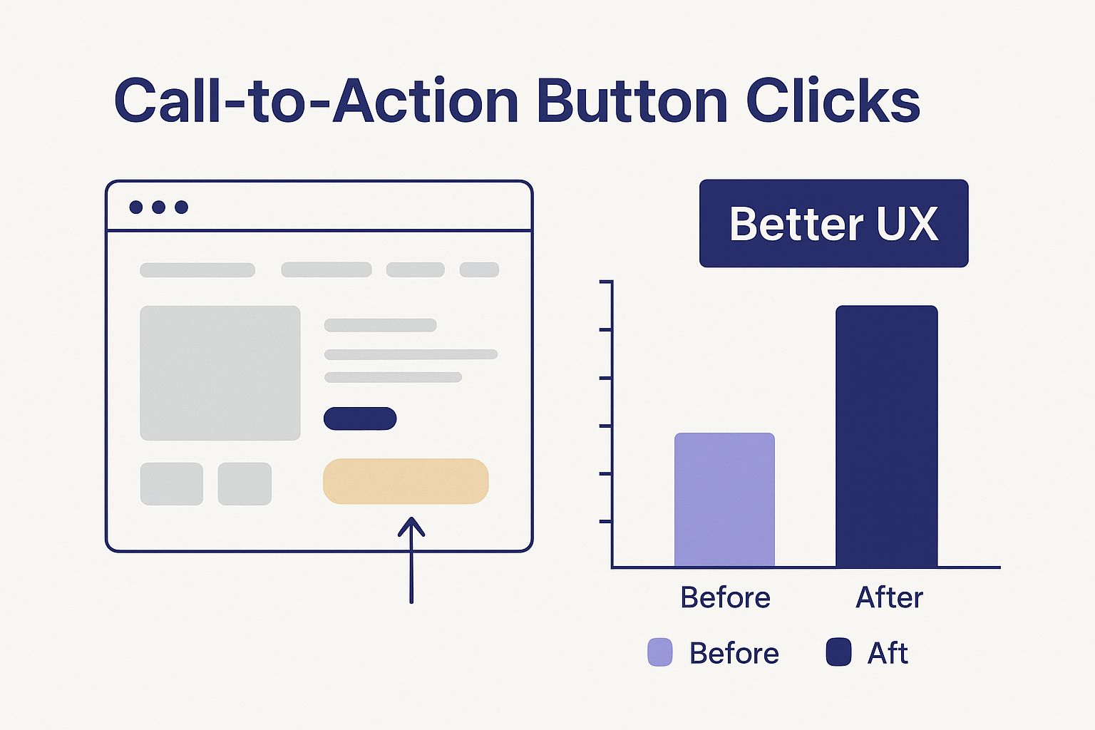
It’s a great reminder that sometimes, even small, thoughtful tweaks to your site’s design can make a world of difference.
When you stop looking at data as just a bunch of numbers and start seeing it as a story, you can quit making random changes and begin implementing fixes that actually work. Your analytics are telling you exactly what your customers want—and where they're getting stuck. The foundation of great conversion optimization is simply learning to listen.
Transform Product Pages Into Conversion Engines
When a shopper lands on your product page, you have their complete attention. This is your digital sales floor, the final pitch before they hit "Add to Cart" or bounce. A confusing or untrustworthy page is a surefire way to kill a sale, but a great one does all the selling for you.
The whole point of a high-converting product page is to make the intangible, tangible. Your customers can't physically touch or try on your product, so your page has to do all the heavy lifting. This is a non-negotiable part of boosting your store's performance.
Captivate with High-Impact Visuals
Let's be real: your product imagery is the very first thing a visitor will judge. If you've got low-quality, pixelated, or single-angle photos, you’re creating immediate doubt and coming across as unprofessional. To build that crucial confidence, you need to give shoppers a complete virtual tour of what you're selling.
Here's how to make your visuals work for you, not against you:
- Multi-Angle Photography: Show your product from every possible angle—front, back, side, top, you name it. Don't forget close-ups of important details like stitching, textures, or connectors.
- Contextual Photos: A product on a white background is fine, but showing it in use is so much better. Selling a backpack? Show someone hiking with it. A coffee mug? Show it steaming on a cozy desk. Help them picture it in their life.
- Engaging Product Videos: Nothing bridges the gap between browsing and buying like video. A short, 30-60 second clip demonstrating features or just showing the product in action can increase conversions by up to 80%.
When you provide rich, detailed visuals, you're answering questions before they're even asked.
Write Descriptions That Actually Sell
Your product description isn't just a spec sheet; it's your sales pitch. The technical details are important, of course, but they don't create an emotional connection. Truly great product copy speaks directly to your customer's problems, needs, and desires.
You have to stop listing features and start translating them into clear benefits. A feature is what your product has, but a benefit is what the customer gets.
| Feature-Focused (Weak) | Benefit-Driven (Strong) |
|---|---|
| "Made with 100% merino wool" | "Stay warm without the bulk with naturally breathable, ultra-soft merino wool." |
| "10,000mAh battery capacity" | "Power through your entire day and then some with a battery that won't quit on you." |
| "Noise-cancelling technology" | "Find your focus and tune out distractions, whether you're on a plane or in a busy office." |
Keep your paragraphs short and use bullet points or bold text to make your descriptions easy to scan. Your goal is to tell a story and show the customer how your product will make their life better. This is a fundamental concept we touch on in our broader guide on how to improve website conversion rates.
Build Instant Trust with Social Proof
It’s a simple truth: shoppers trust other shoppers more than they trust brands. This is what we call social proof—the idea that people will follow the actions of the masses. On your product page, this comes to life through reviews, ratings, and user-generated content (UGC).
A product with zero reviews can be almost as damaging as one with a few bad ones. It signals that nobody is buying it, making new customers hesitant to be the guinea pig.
You have to integrate social proof directly on your product pages to build credibility right where the buying decision happens.
- Display Star Ratings Prominently: Put the average star rating right under the product title. It should be impossible to miss.
- Showcase Customer Reviews: Don't tuck your reviews away on another page. Feature a mix of testimonials that highlight different product benefits.
- Encourage User-Generated Content: Ask your customers to send in photos of themselves using your product. Seeing real people enjoying an item is incredibly persuasive.
Remove Final Doubts and Guide the Purchase
Finally, the best product pages get rid of any last-second friction. Clarity is your best friend here. Be completely transparent about every single cost. Surprise shipping fees at checkout are the number one reason for cart abandonment, so don't fall into that trap.
Make your call-to-action (CTA) stand out. Your "Add to Cart" button should use a vibrant, contrasting color and clear, direct text like "Add to Cart" or "Buy Now." It needs to be the most obvious thing on the page.
Right below that CTA, make sure you have clear info on your shipping policies, return guarantees, and the payment options you accept. These little details provide the final bit of reassurance a hesitant buyer needs to finally click that button.
Slash Cart Abandonment with a Frictionless Checkout
You’ve done all the hard work. A customer found your site, fell in love with a product, and finally hit “Add to Cart.” This should be the moment of celebration, but for way too many online stores, it's the exact point where the sale falls apart.
A clunky, confusing, or surprising checkout process is probably the single biggest conversion killer in all of ecommerce.
Think of it this way: if your product pages are the sales floor, your checkout is the cash register. A long line, a broken card reader, or a surprise fee would send customers walking out of a physical store. The digital equivalent is just as damaging, if not more so. Making this final step as simple as possible is where the real wins are.
The data on this is pretty staggering. On average, a whopping 71.3% of shoppers bail on their carts. That number gets even worse on mobile, jumping to 77.2%. This isn't just a leaky bucket; it's a massive opportunity for any store willing to streamline its checkout and remove that friction. You can see more ecommerce benchmarks over on Speed Commerce.
Eliminate Unwanted Surprises
The absolute fastest way to lose a sale at checkout is to hit someone with unexpected costs. A shopper who was ready to pay $50 for an item will instantly slam the brakes if the total suddenly jumps to $65 after shipping and taxes pop up. It feels deceptive and kills trust on the spot.
Transparency is your best weapon here.
- Show Shipping Costs Upfront: Don't make people wait until the final step. A shipping calculator on the cart page or even estimated costs right on the product page can work wonders.
- Be Clear About Taxes: Integrate tax calculations early. No one likes a last-minute price hike.
When customers know the full cost from the get-go, they can make an informed decision without feeling like they've been tricked. This one change can have a huge impact.
Offer a Guest Checkout Option
Forcing a customer to create an account before they can buy is a classic conversion killer. A lot of shoppers, especially first-timers, just don't want the hassle of creating another username and password. They just want to buy the thing and get on with their day.
By not offering a guest checkout, you're basically telling a customer, "We value your data more than your immediate sale." It’s a surefire way to send them straight to a competitor.
Always, always provide a prominent guest checkout option. You can invite them to create an account on the confirmation page after the sale is complete and the pressure is off. This simple shift respects the customer's time and keeps the path to purchase wide open. For a deeper dive, check out our guide on how to reduce cart abandonment.
Simplify Your Forms
Every single field you ask a customer to fill out is another tiny obstacle. Is asking for their middle name or a second address line really necessary to ship the order? Probably not. A long, intimidating form feels like homework, and it's a common reason people just give up.
The goal is to ask for the absolute bare minimum.
- Use smart features like address auto-complete to cut down on typing.
- Enable single-click sign-ins with Google or Apple.
- Clearly mark required fields and briefly explain why you need certain info (e.g., "Phone number for delivery updates only").
For every form field you can get rid of, you're making it that much easier for someone to give you their money.
Provide Modern and Flexible Payment Methods
The modern shopper expects choices. If your checkout only takes major credit cards, you’re alienating a huge chunk of your audience who prefer digital wallets or other payment solutions. Offering a variety of payment options isn't a luxury anymore—it's a necessity for a high-converting store.
Consider adding these popular options:
- Digital Wallets: Apple Pay, Google Pay, and PayPal offer incredibly fast, one-click checkouts. This is a game-changer, especially on mobile.
- Buy Now, Pay Later (BNPL): Services like Klarna and Afterpay can dramatically boost conversions, particularly for higher-priced items, by splitting the cost into manageable payments.
By catering to different payment preferences, you remove one more potential roadblock and show that your store is modern and customer-friendly. It builds trust and makes that final step completely seamless.
Boost Conversions with a Personalized Site Experience
Let's be honest: a generic, one-size-fits-all website just doesn’t cut it anymore. Today’s shoppers expect—and reward—stores that make them feel seen and understood. Crafting a personalized and responsive site experience is one of the most powerful ways you can stand out, build real loyalty, and directly boost your bottom line.
This isn't about overhauling your site with some complicated, enterprise-level system. It's about using smart, simple tactics to show the right content to the right person at the right time. When you tailor the journey, customers feel a much stronger connection and are far more likely to click "buy."
Implement Smart Product Recommendations
One of the quickest wins in personalization is simply showing customers products they're actually interested in. Think about how the major retailers do it—they’re masters at putting items in front of you that are related to what you've just viewed or added to your cart. You can do the same.
This is where smart product recommendation engines come into play. These tools automatically analyze a shopper's behavior and suggest relevant products, making the experience feel more curated.
- "Customers Also Viewed": This classic feature is great for introducing shoppers to similar items. If the first product wasn't a perfect fit, this keeps them engaged and browsing.
- "Frequently Bought Together": This is a fantastic and completely natural upselling tool. If someone is buying a camera, suggesting a memory card and a case just makes sense. It's helpful, not pushy, and it directly increases your average order value.
Customize the Experience with Dynamic Content
Dynamic content takes personalization a step further by changing what a user sees—like banners, offers, or even text—based on who they are or how they found you. This simple shift makes your marketing feel incredibly relevant.
For example, a first-time visitor lands on your homepage. You could greet them with a banner offering 10% off to encourage that crucial first purchase. A returning customer, on the other hand, might see a banner highlighting your new arrivals or loyalty program. This targeted approach is light-years more effective than blasting everyone with the same generic message.
Don’t just personalize your product suggestions; personalize the entire journey. A visitor arriving from an Instagram ad for running shoes should land on a page that immediately speaks to runners, not a generic homepage. Small contextual adjustments make a huge difference in how a customer perceives your brand.
Make Your On-Site Search Incredibly Fast and Relevant
Your search bar is a direct line into your customer's brain. When someone uses it, they are telling you exactly what they want to buy. A slow, inaccurate search function is a massive point of frustration and a guaranteed way to lose a sale.
Optimizing your on-site search is non-negotiable for improving your conversion rate. A solid search experience needs a few key things:
- Autocomplete Suggestions: Start showing relevant products the moment a user begins typing.
- Typo Tolerance: A simple spelling mistake should never lead to a "no results found" page.
- Rich Results: Display product images, prices, and ratings right in the search results to help users find what they need faster.
Think of your search bar as your best salesperson. When it works well, it connects motivated buyers with their perfect product in seconds, smoothing out the path to purchase.
Prioritize Blazing-Fast Site Speed
Here’s the hard truth: all the personalization in the world won't matter if your website is slow. In ecommerce, speed is everything. We’ve all been there—clicking on a link and waiting… and waiting. Even a one-second delay can cause conversion rates to plummet.
Page speed directly impacts everything from the user experience to your SEO rankings. Slower pages lead to higher bounce rates, especially on mobile, where connections can be less reliable. A sluggish site just feels untrustworthy and unprofessional.
Industry analytics show that a solid ecommerce conversion rate is about 1.9% to 2% globally, but top-tier merchants consistently hit between 4% and 5%. If your store is sitting under 2%, there's a good chance you're dealing with clear issues like poor page speed, confusing navigation, or a clunky checkout. You can find more insights on ecommerce industry benchmarks on convertcart.com.
Making your store faster is a technical task, but it delivers huge returns. Focus on the basics: compress your images, use a content delivery network (CDN), and get rid of any unnecessary code or apps that are slowing things down. A fast, responsive site is the foundation for every other conversion strategy you'll ever implement.
Build Unshakable Trust with Your Customers
In ecommerce, a click is cheap, but trust is priceless. It's the currency that actually drives sales. If a potential customer feels even a hint of doubt about your business, they're gone. Building and showcasing credibility isn't just a nice-to-have; it's the absolute foundation for a healthy conversion rate.
Think about it: every single element on your site either builds that trust or chips away at it. When a visitor feels secure, they're far more likely to click "add to cart." This means making it crystal clear that there are real, helpful people behind the screen.
Humanize Your Brand Story
Your "About Us" page is one of the most underrated assets you have. So many businesses treat it like a dusty old filing cabinet, stuffing it with corporate jargon. This is a massive missed opportunity to actually connect with people and show them why you even exist.
Tell a real story. Were you a weekend warrior who turned a passion into a business? Did you build a product to solve a frustrating problem you faced yourself? Sharing your origin, your mission, and what you stand for makes your brand relatable.
People don't just buy products; they buy into stories and missions they believe in. A genuine "About Us" page transforms you from a faceless online store into a brand with a purpose, making customers feel good about their purchase.
This authentic connection is a powerful driver for both that first sale and long-term loyalty. In fact, building this kind of relationship is a cornerstone of many successful customer retention marketing strategies.
Make Yourself Easy to Reach
Nothing screams "sketchy" like buried contact information. If a customer has a question before buying and can't find an easy way to ask, you’ve probably lost them for good. Accessible support isn't just good service; it's a critical trust signal.
Your contact details shouldn't be a scavenger hunt.
- Display a Phone Number: Even if most people don't call, just seeing a phone number provides instant legitimacy. It shows you're not hiding.
- Offer Live Chat: For those quick, on-the-fence questions, live chat is unbeatable. It proves you're available and ready to help right now.
- Maintain a Clear Contact Page: Include your email, phone number, and physical address if you have one. This simple page reassures customers you're a real business.
When you make it easy for people to find you, you're sending a clear message: you stand behind your products and you actually value their business.
Leverage Authentic Social Proof
Here’s a hard truth: shoppers trust other shoppers way more than they trust brands. This is the power of social proof, and it's one of your most persuasive tools for convincing new customers. Seeing that other people have bought and loved your products removes a massive amount of risk and hesitation.
But authenticity is everything. Vague, generic testimonials just don't work anymore. You need real feedback from real people.
- Customer Reviews and Ratings: Put these front and center on your product pages. A steady stream of recent, honest reviews is incredibly convincing.
- User-Generated Photos: Encourage customers to share photos of themselves using your products. Seeing an item in a real-world context is far more powerful than a slick studio shot.
- Testimonials with Faces: Whenever you can, pair a glowing testimonial with a customer's name and photo. It instantly makes the feedback feel more credible and human.
Be Radically Transparent with Policies
Finally, get ahead of any last-minute jitters by being completely upfront with all your policies. Confusion around shipping costs, return rules, or data privacy can absolutely kill a sale right at the finish line.
Your policies should be written in plain English, be easy to find, and be designed to make the customer feel protected.
Create dedicated, simple pages for your shipping info, return policy, and privacy policy. Then, link to them from your website's footer and from crucial spots like the shopping cart and checkout pages. This kind of transparency signals that you run a fair, customer-focused business, removing that final barrier to purchase.
Ultimately, boosting your conversion rate comes down to improving the entire journey your customers take. You can dive deeper with these 9 Proven Ways to Improve Customer Experience to really get an edge.
Your Questions, Answered
As you start digging into conversion optimization, you're bound to have some questions pop up. It's a big topic. Here are some quick, no-nonsense answers to the most common things we hear from store owners.
What’s a Good Ecommerce Conversion Rate, Really?
Everyone loves to throw around the global average of 2% to 4%, but honestly, that number is mostly noise. A "good" rate is completely relative to your business.
A high-end furniture store might be thrilled with a 0.5% conversion rate because their average order value is huge. On the other hand, a shop selling popular, low-cost phone cases could easily hit 5% or more.
Instead of chasing a universal benchmark, focus on beating your own numbers, month after month. The real goal is consistent improvement. That said, if you're hitting above 3%, you're generally in a pretty healthy spot for most retail niches.
I Don't Have a Big Budget. Where Should I Start?
If you're working with limited funds, you need to go for the low-hanging fruit—changes that pack a punch without costing a dime. The absolute best place to start is your checkout process. It's where the most sales are won or lost.
Here are a few quick wins you can tackle right now:
- Offer Guest Checkout: This isn't optional anymore. Making people create an account is one of the fastest ways to kill a sale.
- Simplify Your Forms: Look at every single field you ask for and ask, "Is this absolutely necessary?" If not, cut it. Less typing equals more conversions.
- Show All Costs Upfront: Nobody likes a last-minute surprise. Display shipping costs and taxes early in the process to build trust and avoid sticker shock.
- Ask for Customer Reviews: Set up an automated email to ask for a review after a customer's order arrives. This is a free, powerful way to generate social proof that helps convince future shoppers.
These tweaks directly target major points of friction and can give you a noticeable lift without needing to spend any money.
How Long Until I See Results from My Efforts?
This really depends on the change you're making. Small, tactical adjustments can show results surprisingly fast. If you tweak a confusing call-to-action button or remove one frustrating field from your checkout form, you could see a measurable impact on a high-traffic page within a week or two.
The trick is to be methodical. Use A/B testing whenever you can. This lets you know for sure if a change is working, so you aren't just making decisions based on a gut feeling.
Bigger projects are a different story. If you're doing a complete website redesign or rolling out a complex personalization strategy, you're playing the long game. It might take a few months to get everything implemented and gather enough clean data to see the true impact.
Should I Optimize for Desktop or Mobile First?
Mobile. Always mobile-first. No question.
Yes, desktop conversion rates are often technically higher, but that's a misleading stat. The reality is that the vast majority of your traffic is probably coming from a phone. Your customer's journey almost always starts on mobile.
Even if they switch to a laptop later to finalize the purchase, that critical first impression happened on their phone. If your mobile site is clunky, slow, or hard to navigate, you’ve already lost them. A smooth mobile experience is the foundation everything else is built on.
Ready to turn more of your visitors into loyal customers? The team at Frozen Crow Inc. provides strategic digital marketing services to help you find conversion bottlenecks, improve your user experience, and drive real growth. See how our data-driven approach can elevate your brand by visiting https://frozencrow.com for a free marketing audit.


