


August 20, 2026
How to Increase Website Conversions: Proven Strategies to Boost Sales
Getting more visitors to your website is one thing. Getting them to actually do something—buy, sign up, or fill out a form—is a whole different ballgame. If your conversion rates are flat, it's not because you're missing some magical "convert now" button. It's almost always a problem of friction.
Think of it this way: every roadblock, every moment of confusion, and every ounce of doubt you create for a visitor makes it easier for them to just leave. To boost your website's conversions, you have to find and systematically eliminate that friction. It all boils down to nailing three things: creating a dead-simple user experience (UX), having a crystal-clear value proposition, and building unshakable trust.
Why Your Visitors Aren't Converting
It's a frustrating spot to be in. The traffic is there, but the results aren't. People land on your site, click around a bit, and then vanish without a trace. This isn't just bad luck; it’s a clear signal that there's a disconnect between what your visitors want and what your website is delivering.
Before you start A/B testing button colors or scrambling to rewrite every headline, you have to play detective. The real reasons people bail usually fall into a few predictable buckets:
- Poor User Experience (UX): Is your navigation a confusing mess? Does your site take forever to load on a phone? Is the checkout process a 12-step nightmare? Any of these will send potential customers running for the digital exit.
- Weak Value Proposition: If someone lands on your site and can't figure out what you do and why you’re better than the competition in about five seconds, they're gone. It's that simple.
- Lack of Trust: An outdated design, no customer reviews, or missing security seals on your payment page can make visitors feel uneasy. If they don't trust you, they're definitely not giving you their credit card information.
Pinpointing the Problem with Data
Guessing which of these is the culprit is a recipe for wasted time and money. The good news is, you probably already have the data you need to find the real answers. Tools like Google Analytics are less of a boring dashboard and more of a treasure map pointing directly to your biggest problems—and opportunities.
By digging into how real people are behaving on your site, you can stop making assumptions and start forming evidence-based ideas about what to fix.

This kind of high-level overview is just the start. You can see where your traffic is coming from and how engaged those visitors are. But the real magic happens when you start segmenting this data.
I see this mistake all the time: people get hung up on the total number of visitors. The insights that actually matter come from slicing up that traffic. Are people coming from your paid ads bouncing twice as often as your organic search traffic? That tells you exactly where to focus your investigation first.
Understanding these core issues is the foundation of any successful conversion strategy. Instead of throwing random changes at the wall to see what sticks, you can start methodically fixing the specific friction points that are costing you sales.
To give you a clearer picture, I've broken down these core concepts into a simple table. Think of this as your roadmap for turning more clicks into customers.
Key Focus Areas for Boosting Website Conversions
A summary of the primary strategies and their impact on turning website visitors into customers.
| Strategy Area | Primary Goal | Key Actions to Implement |
|---|---|---|
| User Experience (UX) | Make it effortless for visitors to achieve their goals on your site. | Simplify navigation, improve page speed, optimize for mobile, and streamline checkout. |
| Value Proposition | Clearly and quickly communicate what makes your offer unique and valuable. | Craft compelling headlines, use clear calls-to-action (CTAs), and highlight key benefits. |
| Trust & Credibility | Build confidence so visitors feel safe becoming a customer. | Display customer reviews, show security badges, feature testimonials, and maintain a professional design. |
Focusing on these three areas provides a solid, data-driven framework. Throughout the rest of this guide, we'll dive deep into each one, giving you a clear plan to diagnose your site's specific problems and implement solutions that actually work.
Right, before you start swapping out button colors or A/B testing headlines, you need to put on your detective hat. The real secret to lifting your conversion rate isn't about guesswork or following the latest trend. It’s about digging into your data to find the exact spots where people are getting stuck, confused, or just plain giving up.
Think of it like finding leaks in a pipe. You have to find the biggest holes first, because patching those will give you the most immediate results. We're moving past vanity metrics like total site visits and getting into the why behind the numbers. This is where a tool like Google Analytics becomes your best friend, helping you piece together the story your users are trying to tell you.
Pinpoint Your Underperforming Pages
First things first: not all pages are created equal. Your product pages, checkout funnel, or pricing table are mission-critical. These are the places where the magic is supposed to happen. Your first job is to figure out which of these high-stakes pages are dropping the ball.
Dive into your analytics and pull up your top landing pages. You're looking for two key metrics here: bounce rate and exit rate. A high bounce rate means visitors take one look and leave. A high exit rate on a specific page means it’s the last thing they see before they're gone for good.
Let's say your main "services" page gets a ton of traffic, but it has an 85% exit rate. That’s a massive red flag. It tells you that people were interested enough to click, but something on that page completely snuffed out their motivation. That page just became your prime suspect.
Trace the User Journey to Find Drop-Off Points
Okay, so you've identified which pages are the problem children. Now you need to figure out why. This is where you trace the user journey, visualizing the path people take through your site. Where do they come from? Where do they click next? And, most importantly, where do they bail?
Google Analytics has flow reports that are perfect for this. Imagine you run an e-commerce store and you notice a huge number of people drop off between adding an item to their cart and getting to the payment page.
That’s not random. It's a specific, costly roadblock. Now you can start forming some educated guesses (hypotheses):
- Are surprise shipping costs the culprit?
- Is the form asking for way too much information?
- Could there be a technical glitch on that page?
By finding that exact drop-off point, you’ve gone from a vague problem like "our checkout is broken" to a focused, testable issue.
You don't need a hundred data points to get started. Just find one significant drop-off in your conversion funnel. That single insight is more valuable than a dozen small observations because it points directly to your biggest opportunity for a quick win.
Segment Your Audience to See Who Actually Converts
An overall conversion rate of 2% doesn't really tell you much. The real story is hidden in the details. The game-changing insights appear when you start slicing up your audience to see how different groups behave.
For example, are mobile users converting at a lower rate than desktop users? Are visitors from your email list outperforming those from paid ads?
Analyzing where your traffic comes from is especially revealing. Some research shows that direct traffic (people typing your URL right into their browser) often converts the best, averaging around 3.3%. This makes sense—they already know and trust you. Paid search can be great, too, but its performance is all over the map depending on the industry. You can learn more about how traffic sources affect conversion rates to see where you stack up.
Let's walk through a real-world scenario. You notice that traffic from your Instagram ads has a crazy-high bounce rate—we're talking 90%—while your organic search traffic is converting just fine.
Time to segment and diagnose:
- Look at the Ad: Is the ad creative or copy making a promise that the landing page doesn't keep? A mismatch between the ad's hook and the page's content is a classic conversion killer.
- Check the Landing Page: How does the page load on a phone? Instagram is a mobile-first platform. A clunky, slow-loading page will send users running for the hills.
- Review the Audience: Are you even targeting the right people on Instagram? If your offer doesn't align with the audience you're paying to reach, you're just burning cash.
By breaking it down like this, you can form a solid hypothesis: "Our Instagram traffic isn't converting because the landing page is a terrible experience for mobile users who clicked our ad." This isn't a guess anymore. It's a data-backed starting point for making changes that actually matter.
Designing a Frictionless User Experience
A clunky, confusing, or slow website is the fastest way to kill a sale. I always tell clients to think of it like a physical store with cluttered aisles and no signs—customers just get frustrated and walk out. Your website's user experience (UX) is your digital storefront, and making it clean, intuitive, and fast is a non-negotiable step in boosting conversions.
When someone lands on your site, they need to instantly understand where they are, what they can do, and how to find what they're looking for. Every moment of hesitation or confusion adds friction, which is the absolute enemy of conversion. Our goal is to sand down those rough edges and create a smooth, easy path from the first click to the final action.
Simplify Navigation for Effortless Discovery
Your website’s navigation is the map you give your visitors. If that map is hard to read, they’ll get lost and leave. Simple as that. The best navigation systems are so intuitive that users don't even have to think about them; they just flow through the site.
The key is to reduce the number of clicks it takes for someone to find what they need. A classic mistake I see all the time is overwhelming visitors with a dozen choices in the main menu. Stick to your most important, high-level categories.
- Create a Logical Hierarchy: Group related pages under clear parent categories. If you run an apparel store, this means main menu items like "Men," "Women," and "Kids," with drop-downs for specific items like "Shirts" or "Pants."
- Use Descriptive Labels: Ditch the jargon or clever, branded names. Use straightforward terms your audience actually uses. "Contact Us" will always perform better than "Get in Touch."
- Make the Search Bar Obvious: For any site with a lot of content or products, a prominent search bar is a must. Let people find exactly what they’re looking for without forcing them to browse endlessly.
A streamlined navigation structure directly impacts your ability to convert because it makes the user's journey feel effortless. They feel in control, and that builds confidence in your brand.
Make Your Calls-to-Action Impossible to Ignore
Your Call-to-Action (CTA) button is the single most important element on any conversion-focused page. Its only job is to stand out and clearly tell the user what to do next. A weak, buried, or confusing CTA is a massive conversion roadblock.
Designing a compelling CTA is part science, part art.
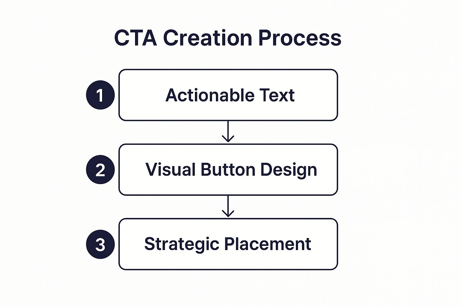
First, use action-oriented language. Start with a verb that commands action. Instead of a passive word like "Submit," try "Get Your Free Quote." Instead of the generic "Learn More," consider something specific like "See Pricing Plans." This language creates urgency and clarifies exactly what will happen when they click.
Next, create visual contrast. The CTA button should be one of the most eye-catching things on the page. Use a color that pops against the background but still fits your brand palette. Don't make people hunt for it.
Finally, be strategic with placement. Place your primary CTA "above the fold"—the part of the page a user sees without scrolling. For longer pages, it’s a great idea to repeat the CTA at key decision points so it’s always within reach the moment they're ready to act.
Key Takeaway: A great CTA doesn't just ask for a click; it promises value. "Download My Free eBook" is powerful because it emphasizes what the user gets, not just what they have to do.
Prioritize Page Speed to Keep Users Engaged
In the world of web performance, every single second counts. A slow-loading website is one of the biggest, most unforgiving conversion killers out there. We've all been there: you click a link, the page hangs, and you smash the back button out of sheer impatience. Your visitors are no different.
The impact of speed on conversions is staggering. It’s one of the most critical factors influencing your conversion rates, period. Data shows that websites loading in just one second can have conversion rates up to five times higher than those taking 10 seconds. For e-commerce sites, the numbers are even starker: a one-second load time results in conversion rates 2.5 times higher than a five-second load time. You can dig into more of these stats on how speed impacts conversions at Wordstream.
To see where you stand, use a free tool like Google's PageSpeed Insights. It’ll analyze your site's performance and give you a checklist of actionable recommendations for improvement.
Here’s a look at the PageSpeed Insights dashboard, showing scores for both mobile and desktop.
This report breaks down exactly what's slowing your site down, so you know where to focus your efforts.
Fixing these issues doesn't have to be super technical. Here are a few common culprits and their solutions:
| Problem | Simple Solution | Impact on Speed |
|---|---|---|
| Large Image Files | Compress images before uploading using a tool like TinyPNG. | High |
| Excessive Code | Use a plugin to "minify" your HTML, CSS, and JavaScript files. | Medium |
| Slow Server Response | Enable browser caching so repeat visitors' browsers don't have to reload everything. | High |
By focusing on these three fundamentals—navigation, CTAs, and page speed—you'll create a far better user experience. When you remove these common points of friction, you simply make it easier for visitors to say "yes."
Crafting Copy and Offers That Convert
A great design can guide your visitors, but it's your words that actually get them to act. Think of your website copy as your best salesperson, working 24/7. If it isn’t compelling, you're just leaving money on the table.
Your copy has one primary job: to answer the visitor's most important question, "What’s in it for me?"
Truly effective copy doesn't just list features; it sells a better version of the user's life. It has to connect directly with their pain points and frame your product as the only logical solution. To get there, you need to weave in actionable SEO content writing tips so your content doesn't just convert—it gets found in the first place.
Write Headlines That Stop Scanners
Let's be honest: most people don't read websites, they scan them. Your headlines are often the only thing guaranteed to get a glance, so they have to work incredibly hard to pull someone in.
A generic headline like "Our Services" does absolutely nothing to spark interest. A great headline needs to be one of two things:
- Benefit-Driven: It immediately tells the user how their life will improve. Instead of "Email Marketing Software," try something like, "Send Emails Your Customers Actually Want to Open."
- Intrigue-Driven: It asks a provocative question or makes a bold claim that demands an answer. "Is Your Website Leaking Money?" is far more magnetic than a bland "Website Analytics."
The goal is to stop the scroll. That’s the first and most critical hurdle you need to clear.
Clearly Articulate Your Value Proposition
Your value proposition is a short, punchy statement explaining why someone should buy from you and not your competitor. It needs to be front and center, often right under your main headline.
If a visitor can’t figure out what makes you special in five seconds, they're gone.
A strong value proposition instantly answers three questions:
- What problem do you solve?
- What are the specific benefits?
- Why are you the best choice?
Take a project management tool, for example. Its value prop could be: "The only project tool that brings your team, tasks, and deadlines into one calm, organized place." It's clear, focuses on a benefit (calm and organized), and hints at what makes it unique.
Deploy Social Proof to Build Trust
People trust other customers way more than they trust you. It’s just human nature. This is called social proof—the tendency to assume that if other people are doing something, it must be the right thing to do.
You can use this to your advantage by placing trust signals at key decision points.
Your potential customers are looking for reassurance. They want to know that people just like them have bought from you and were happy with the result. Showing them real-world proof is one of the most powerful conversion tools you have.
Here are some of the most effective forms of social proof:
- Customer Testimonials: Short, impactful quotes from happy clients.
- Case Studies: Deeper stories showing how you helped a customer solve a specific problem.
- Star Ratings and Reviews: These are gold, especially on product and checkout pages.
- Trust Badges: Logos of well-known clients or security seals (like Norton or McAfee).
Sprinkle these elements near your CTAs or on your pricing page. They work wonders to dissolve doubt right when a user is on the fence.
Structure Irresistible Offers
Finally, the offer itself needs to feel like a no-brainer. It's not just about the price; it’s about the perceived value you create and the psychological nudges you use to encourage action.
A well-structured offer can dramatically increase your chances of getting a "yes."
Think about how you can create a sense of urgency or scarcity without sounding cheesy or manipulative. Here are a few proven tactics:
- Limited-Time Discounts: "Get 20% off, this week only."
- Scarcity Cues: "Only 3 left in stock!"
- Free Trials or Demos: This completely removes the risk for the user, making it an easy first step.
- Bonuses: "Sign up today and get our free setup guide."
When you combine powerful copy with undeniable social proof and a compelling offer, you build a persuasive case that’s hard to refuse. You’re no longer just selling a product; you're building a clear, trustworthy path to conversion.
Building a System for Continuous Optimization
Improving your conversion rate isn't a project you check off a list; it's a fundamental shift in how you operate. You have to start thinking of your website less like a static brochure and more like a dynamic sales floor that can always be improved. This is where you move beyond one-off tweaks and build a system—a feedback loop of testing, learning, and refining.
This whole process is what we call Conversion Rate Optimization (CRO). It’s all about making data-driven decisions to consistently level up your site's performance. It’s how you stop guessing and start building a predictable engine for growth that evolves right alongside your customers.
The Foundation of Effective Testing
Before you even think about launching an A/B test, you need a solid, evidence-based hypothesis. A hypothesis isn't just a vague idea like, "Maybe a red button would work better." A real hypothesis is a clear statement that lays out a proposed change, the outcome you expect, and why you expect it.
For instance, a weak idea is: "Let's test a new headline."
A strong hypothesis sounds more like this: "Changing the headline from 'Our Marketing Services' to 'Double Your Leads in 90 Days' will increase form submissions because it focuses on a specific, tangible benefit that our target audience values, creating more urgency and clarity."
See the difference? This structure forces you to connect a change to a specific user behavior and a business goal. It makes your tests strategic instead of just random shots in the dark.
Prioritizing What to Test First
Okay, so you’ve got a few strong hypotheses. Now what? You can't test everything at once, so you have to prioritize. A simple but incredibly effective way to do this is with the PIE framework: Potential, Importance, and Ease.
- Potential: How big of an improvement could this change realistically make? A small copy tweak on a low-traffic blog post has way less potential than overhauling your checkout page.
- Importance: How valuable is the traffic to this page? Your highest-traffic, highest-intent pages—think product or pricing pages—are the most important places to focus your energy.
- Ease: How quickly can you get this test up and running? A simple headline change is worlds easier than a full page redesign that requires developer time.
Score each idea against these three factors to build a prioritized roadmap. This ensures you're always working on the changes that promise the biggest impact for the least amount of effort.
A classic mistake is getting bogged down testing tiny details on low-impact pages. Always, always focus your first efforts where the money is: your primary conversion funnels. A small win on a high-traffic page will almost always outperform a huge win on a page nobody sees.
Running Meaningful A/B Tests
With a prioritized hypothesis ready to go, it’s time to run an A/B test. A/B testing, or split testing, is pretty straightforward: you show two versions of a page (A and B) to different segments of your audience at the same time to see which one performs better. Version A is your control (the original), and Version B is your variation with the change.
Historically, a tool like Google Optimize was the go-to for this, but plenty of other platforms offer powerful testing features today.
The single most critical part of testing is letting it run long enough to reach statistical significance. This just means you have enough data to be confident the results aren't a fluke. Don't call a test after a couple of days or a handful of conversions. Most tools will tell you when you've hit a confidence level of 95% or higher—that's your green light to make a call.
Understanding the Broader Conversion Landscape
While you're deep in the weeds of testing, it helps to zoom out and see where you stand. The average global ecommerce conversion rate usually floats between 2.5% and 3.0%. More established brands might push closer to 4%, while newer stores often land around 2%.
Knowing these benchmarks helps you set realistic goals. If your rate is 1%, shooting for 2% is a massive win and a great first objective. If you're already at 3%, your next victory will probably come from more subtle, targeted tests.
To really dive in and build a robust system for continuous improvement, I highly recommend checking out this ultimate conversion rate optimization guide.
Ultimately, building a testing culture means everyone on your team—from marketers to designers—starts asking, "How can we test that?" It shifts the entire conversation from opinions to data, creating a powerful and sustainable way to grow your business for the long haul.
Your Website Conversion Questions Answered
Jumping into conversion optimization always kicks up a few questions. It’s totally normal to wonder if you’re heading in the right direction or if your goals are even realistic. Let's clear up some of the most common questions so you can move forward with confidence.
What Is a Good Website Conversion Rate?
This is the million-dollar question, and the honest answer is always: it depends. A "good" conversion rate is completely contextual. It shifts wildly depending on your industry, where your traffic is coming from, and what you’re actually selling.
For example, a high-end B2B service might pop the champagne for a 0.5% conversion rate on demo requests. On the other hand, an e-commerce store selling impulse-buy items could be aiming for 3-4%.
Instead of getting hung up on a universal number, you should be laser-focused on your own benchmarks. A truly good conversion rate is one that’s consistently getting better.
The better question to ask is, "What was my conversion rate last month, and what's my data-driven plan to beat it this month?" This simple shift moves your focus from vague industry averages to your own continuous improvement—and that’s where the real growth happens.
As a general rule of thumb, the average website conversion rate tends to fall somewhere between 2% and 5%. If you’re below that, you’ve got a clear opportunity for improvement. If you're already in that range or above it, your job is to chase those incremental gains and optimize specific audience segments.
How Long Until I See Results?
Patience is everything in conversion rate optimization (CRO). Sure, some quick fixes, like a broken button, can give you an instant lift. But most meaningful improvements take time to properly validate. You're not looking for a single silver bullet; you're building a system of informed improvements.
Here’s a realistic timeline to keep in mind:
- Initial Data Gathering (Weeks 1-4): This is your discovery phase. You'll be auditing your site, digging into analytics to find problem areas, and forming your first few test ideas (hypotheses).
- Running Your First Tests (Weeks 5-8): Time to launch your A/B tests. The key here is letting them run long enough to gather statistically significant data. Never, ever end a test after just a few days, even if one version looks like a clear winner early on.
- Analyzing and Implementing (Weeks 9+): Once a test is complete, you analyze the results, roll out the winning version, and immediately move on to the next test on your priority list.
Sustainable lifts in your conversion rate are the result of an ongoing process, not a one-and-done project. It’s a marathon, not a sprint.
How Do I Prioritize My First Tests?
Once you start digging into your data, it's easy to get overwhelmed. Suddenly, a hundred potential things to fix are staring you in the face. Everything from the homepage headline to the checkout form layout can seem critically important.
You need a way to cut through the noise. A simple prioritization framework is your best friend here. One of the most effective I've used is the PIE framework: Potential, Importance, and Ease.
- Potential: How much room for improvement is there on this page? A landing page with tons of traffic but an awful bounce rate has massive potential.
- Importance: How valuable is this page to your bottom line? Changes to your checkout or pricing pages are far more important than tweaking the "About Us" page.
- Ease: How difficult will this actually be to implement? Testing a new headline is easy. Redesigning your entire site navigation is not.
Give each test idea a score from 1 to 10 for each of these three criteria. The ideas with the highest total scores go straight to the top of your list. This simple method ensures you’re spending your limited time and resources on the changes most likely to deliver big wins, fast.
At Frozen Crow Inc., we turn these principles into a powerful growth strategy for your business. Our team uses data-driven insights to find your biggest conversion opportunities and implement solutions that deliver measurable results. Learn more about how our digital marketing and IT services can help you grow.


